Quantcast
Channel: ArchDaily Global
Viewing all 51086 articles
Browse latest View live

To Design for the Elderly, Don't Look to the Past

$
0
0
Dominique Coulon & associés. Image © Eugeni Pons Dominique Coulon & associés. Image © Eugeni Pons

When the world undergoes major changes (be it social, economic, technological, or political), the world of architecture needs to adapt alongside. Changes in government policy, for example, can bring about new opportunities for design to thrive, such as the influx of high-quality social housing currently being designed throughout London. Technological advances are easier to notice, but societal changes have just as much impact upon the architecture industry and the buildings we design.

The same is true of changes in demographics, and we are in the midst of a monumental shift. In 2015, 8.5% of the population of the world was aged 65 or over (617 million people). This is predicted to grow to 12% of the population by 2030, and to a staggering 16.7% of the population by 2050 [1]. Historically, this percentage has steadily grown but dramatic advances in medicine are allowing people to live longer, creating aging populations across the globe. This problem is compounded in countries where the birth rate is also incredibly low, as is the case with Japan. We must reevaluate how the elderly are treated within society.

When thinking about the impact of these statistics, the natural assumption within the context of architecture is to think about medical care, hospital design, and accessible cities. However, this overlooks an emerging and serious problem: loneliness and social isolation. Within the UK, 51% of those aged over 75 live alone, and 11% of older people are in contact with friends and family less than once a month [2]. Similar results are present across Europe.

Chronic loneliness within the elderly population is incredibly prevalent and a significant number of studies have been conducted looking at the measurable health impact it has, such as creating a higher risk of disabilities, heart disease, strokes, and dementia. Architects can help tackle loneliness at the source and dramatically help increase the quality of life for a portion of the population who are often isolated. This article explores how good design can help further this cause, how architects have combated this previously, and what the industry leaders are doing now.

In recent years, architects and developers alike have begun to rethink how housing for the elderly should be treated. Multiple panels discussing and studying the needs of the modern older person have been held, including with RIBA and New London Architecture. The new approach features light, modern and very sensitively designed property - the exact opposite of the traditional image. In these schemes, part of the solution is making the housing desirable to residents regardless of perceived or traditional tastes. Living in modern retirement communities provides an opportunity for engagement and interaction while beginning to shed this stigma, and allowing residents to retain their independence.
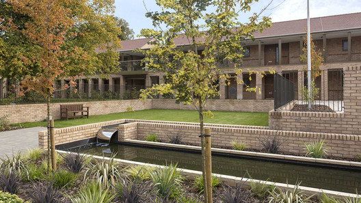
Pilgrim Gardens / PRP . Image © Tim Crocker, via Matthew Usher Pilgrim Gardens / PRP . Image © Tim Crocker, via Matthew Usher

The Housing our Ageing Population Panel for Innovation (serendipitously acronymed HAPPI) was originally held in 2009, and their reports have since become industry standard. The original 2009 report featured multiple high-quality case studies from throughout Europe, and subsequent issues featured not just the panel's findings but guides for implementation. Advice includes ranges from the architectural  (generous space standards, daylight, and adaptability for ‘care readiness’) to the social (engaging positively with the public.)  It is the latter part of this range that is most crucial and can be combined with architectural standards. 

PRP have become leaders within this field and heavily draw upon this advice from the HAPPI reports. Their Pilgrim Gardens project won multiple awards between 2012-2014 and features several of the design features advised by HAPPI. Double-aspect flats encircle communal garden spaces of hard and soft landscaping, and a shared colonnade acts as a slow circulation space. In-built sliding glass doors to allow the use of the balconies year round.

Nursing and Retirement Home / Dietger Wissounig Architekten. Image © Paul Ott Nursing and Retirement Home / Dietger Wissounig Architekten. Image © Paul Ott

While focusing more on those requiring care, Dietger Wissounig Architekten’s nursing home in Austria employs a similar effect internally and is incredibly light, liberally using timber and wood within to create a soft and caring environment. Double-stacked corridors are again avoided, allowing the circulation to be inhabited socially as inviting spaces.

Nursing and Retirement Home / Dietger Wissounig Architekten. Image Courtesy of Dietger Wissouning Nursing and Retirement Home / Dietger Wissounig Architekten. Image Courtesy of Dietger Wissouning

The report also highlights the need for multipurpose space where the residents can meet and which could possibly act as a hub for the local community. At The Architect in Utrecht, residences for the elderly requiring care are stitched into the building with the rest of the housing alongside communal spaces and the nursery. Similar projects by Haptic in Norway and Witherford Watson Mann’s almshouse in London also stress the need for social connection. These projects share spaces between neighbors, school children, and the local community through gardens, allotments, shops, and public squares.

The Architect / LEVS architecten. Image © Marcel van der Burg, via Matthew Usher The Architect / LEVS architecten. Image © Marcel van der Burg, via Matthew Usher

Cities have begun to acknowledge the changing needs of an aging population. The ‘Campaign To End Loneliness’ has established a framework of three methods in order to address the multifaceted issue: individual intervention, neighborhood action, and a whole system approach. To help combat the wider scale challenges, the city of Manchester has become the UK’s first ‘age-friendly city’ [4], a World Health Organisation initiative which several forward-thinking cities across the world have subscribed to. The key priorities of the initiative include known benefits such as improvements in transport, housing, and health services, but also highlights the need for civic participation.

Architects can take a leading role in the design of new policy. In Manchester, the ‘Age-Friendly Design Group’ assists with designing local parks to be more age-friendly, listening to the elderly to inform good practice, and publishing of design guidelines. Stephen Hodder, a previous RIBA president, said that such groups open up a “much-needed debate on how we can start shaping the landscape of our built environment for our older age”.
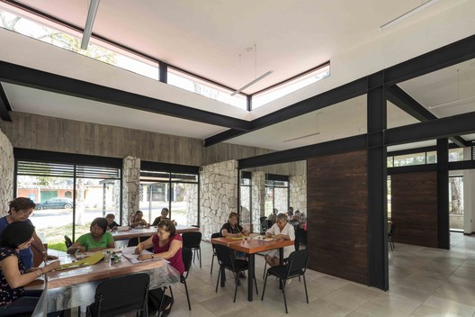
Casa del Abuelo / Taller DIEZ 05. Image © Luis Gordoa, via Matthew Usher Casa del Abuelo / Taller DIEZ 05. Image © Luis Gordoa, via Matthew Usher

Outside of the city-scale, architectural solutions can also provide for a range of needs. Public ‘day-stay’ centers, such as the Casa del Abuelo in Mexico seem particularly popular (especially in Spain and Portugal.) The design of centers such as these is often strikingly modern and open, blurring the distinction between inside and out. This can partly be attributed to the temperate climates these projects are located in, but the prevalence hints at an emerging approach.

The Guangxi senior center in China, serves an atypically large population and features a range of activities and spaces to accommodate this. The undulating form, clad in wood grain aluminum louvers, includes everything from game courts and gardens to an indoor swimming pool and table tennis rooms. This haven of activity attempts to engage the elderly in physical activity alongside social spaces.

 Senior Center of Guangxi / Atelier Alter. Image Courtesy of Atelier Alter, via Matthew Usher Senior Center of Guangxi / Atelier Alter. Image Courtesy of Atelier Alter, via Matthew Usher

Particular success can be found when positioning these centers as hubs for the local neighborhoods rather than simply as single-purpose structures. This method is similar to The Architect in Utrecht, This can include proximity to other types of housing (such as The Architect) but can also be integrated with libraries or universities. A successful example of this is Sant Antoni - Joan Oliver Library, by Pritzker Prize-winning practice RCR Arquitectes.

The project is nestled within one of Barcelona’s city blocks, wrapping around a central courtyard. The library forms the public face of the building and primary programmatic element, appearing to be suspended between two apartment buildings. The community space then occupies one wall of the courtyard and overlooks the public space. This maintains the perceived ‘safe space’ but places it firmly around a local hub, unifying the project into a coherent block.

Sant Antoni - Joan Oliver Library / RCR Arquitectes. Image © Eugeni Pons Sant Antoni - Joan Oliver Library / RCR Arquitectes. Image © Eugeni Pons

A final method is to promote interaction between the young and the elderly. These may seem to be an odd combination of programmes, but significant research is being undertaken into this and the centers which currently subscribe to these ideals and offer them in a safe and secure way.

At the beginning of this article, Japan was noted to be one of the countries most impacted by aging populations going forwards. Increasing life expectancy and societal changes (leading mothers to work outside the home) has meant the numbers both nurseries and senior centers/retirement homes are increasing. There is clearly an opportunity to restructure the way care is delivered for both young and old - something Japan has already been doing for over 40 years. Kotoen, a “yoro shisetsu” (facility for the children and the elderly) in Tokyo, is the oldest age-integrated facility in Japan, having opened in 1976. Here, interaction cuts both ways: seniors can volunteer in the nursery, children visit the communal areas of the care home, and both join together for special events. 

JIKKA / Issei Suma. Image © Takumi Ota JIKKA / Issei Suma. Image © Takumi Ota

When adjoined to care homes, the benefits of this arrangement make sense. Both share basic needs: the provision of meals, physical activity (in the case of the elderly, to keep them active and fit), and communal spaces for socializing. The benefits for the elderly are fairly obvious. The arrangement provides company and activity, bringing life into a space which can often become mundane. But there are notable social and developmental benefits to the children as well: it helps to promote a healthy and positive view of aging and helps counter any preconceptions about the less able.

Mount St. Vincent, a care home in Seattle, runs an ‘Intergenerational Learning Centre’ and endorses similar benefits, stating that it helps to provide a broader perspective of family life for the children who do not have grandparents active in their life.

Surprisingly, there is a dramatic and measurable impact of this upon the physical and mental health of the elderly. St. Monica’s Trust in Bristol housed a study into these benefits, measuring the impact upon the residents over a six week period. At the end of the study, 80% of the residents had improved their mobility and grip strength, and 70% has reduced their score on the scale of depression.

So how can architects begin to promote and further this idea? The impact upon loneliness of aligning these programmes together is dramatic, but the majority of the examples across the world are activity and event-driven. There is the opportunity to develop a new building type to house this program and best suit the needs of the young and old, rather than attempting to retrofit existing spaces. Neither senior citizens nor children want to live in a dull environment, so adapting the design creatively to suit the characteristics of their users is a wonderful opportunity rarely given.

London Almshouse / Witherford Watson Mann. Image Courtesy of Witherford Watson Mann London Almshouse / Witherford Watson Mann. Image Courtesy of Witherford Watson Mann


Gubrandslie Cabin / Helen & Hard architects

$
0
0
© Rasmus Norlander © Rasmus Norlander
© Ragnar Hartvig © Ragnar Hartvig

Text description provided by the architects. The private Cabin is situated near Tyinkrysset, Filefjell, on a beautiful site at the border of Jotunheimen National Park. Our main approach was to make as little impact on the site as possible. The weather can be quite rough with loads of snow, so it has been important to shelter the chalet from wind and snow. Based on the result of extensive wind studies, the roof is shaped like the surrounding landscape, integrated to the terrain, making it easier for both the wind and snow to drift over.

Mountain Diagrams Mountain Diagrams
© Rasmus Norlander © Rasmus Norlander

The L-shaped volume has a semi-closed wall next to the entrance that opens up towards the magnificent view from the more private part of the cabin. The windows also have shapes inspired by the amazing landscape. Sauna and wardrobes are placed under ground in the concrete basement, alongside ski storage and car parking.

Plans Plans
© Rasmus Norlander © Rasmus Norlander

On top of the fundament, above terrain, a wooden box containing the main volume and space of the cabin, is placed. The volume is further divided into three levels to follow the topography. This spatial organization produces an open main floor, yet clearly demarcated in different levels and integrated interior.

© Rasmus Norlander © Rasmus Norlander

The construction of the cabin is made of prefabricated solid wooden elements of spruce which resulted in a short construction time, a great advantage on site in the mounty scenery and due to the sometimes harsh weather conditions.

© Rasmus Norlander © Rasmus Norlander

Apple Unveils Greenest MacBook Ever, New iPad and Mac Mini

$
0
0
© Apple © Apple

Apple has released new details about their MacBook Air, Mac Mini and iPad Pro. The MacBook Air has finally gotten the long-requested Retina Display, and the design has new features like its Touch ID fingerprint sensor. The broad redesign also extends to the new iPad Pro, where the design nearly gets rid of the bezel that has traditionally wrapped around the sides of the screen and Apple's Face ID facial recognition technology has been included in the tablet for the first time ever.

© Apple © Apple

The iPad Pro is being increasingly used by architects with the addition of the Apple Pencil for more fine-tuned control alongside side-by-side apps. The new iPad Pencil stylus works with support for gestures that let you switch between the different digital brush styles. For work, you can attach a keyboard with two different viewing angles, and your chances of losing pencil at the construction site are diminished thanks to its new magnetic attachments to the side of the device. It now charges by clicking onto the top of the tablet, and features a button on the side that can be press for extra controls. Alongside that came a new look for the Smart Keyboard sold alongside the iPad Pro. The new iPad Pro comes in two sizes: an 11-inch version and a bigger 12.9-inch size. The smaller one starts at $769 and the bigger at $969. Both are available to order now and will also go on sale on 7 November. See below for a quick summary of the updates:

MacBook Air, Mac Mini

© Apple © Apple

The new MacBook Air model gets the Retina display, but Apple dropped the USB-A ports and SD card reader, just like it did when it redesigned the MacBook Pro in 2016. In its place are two Thunderbolt 3 / USB-C ports for power and connectivity. The Air also features Apple's third-generation butterfly keyboard, which is supposed to be quieter and less prone to failure than earlier models.

  • The Mac Mini now comes in Space Gray and, more importantly, has new innards. It starts at $799.
  • The new MacBook Air features Intel's latest, 8th-generation Core i5 processors, up to 1.5TB of storage and 16GB of RAM.
  • The MacBook Air 2018 with Retina display, Touch ID and other features inherited from modern MacBook Pros. It starts at $1,199.

iPad Pro 2018

© Apple © Apple

It's been over a year since Apple has given an update to the iPad Pro, and the new model includes a range of features. The new eight-core, A12X Bionic chip is a 7-nanometer piece of silicon with speeds up to 35 percent faster than the previous iPad Pro. That's just in single-core, though -- multicore speeds are up to 90 percent faster. The iPad Pro is the first iOS device to use USB-C for power and data.

  • An updated magnetically attaching Smart Folio keyboard case.
  • The new iPad Pro has thinner bezels, USB-C connections, 264ppi display and more.
  • A redesigned Apple Pencil with a magnetic connection and automatic pairing.
  • Apple showcased some new apps for the iPad Pro.
  • The new iPad Pro costs $799 for the 11-inch model and $999 for the 12.9-inch display.

Devani Home / RNDSQR

$
0
0
© Jamie Anholt © Jamie Anholt
  • Architects: RNDSQR
  • Location: Calgary, Canada
  • Lead Architects: Majida Devani
  • Area: 3100.0 ft2
  • Project Year: 2017
  • Photographs: Jamie Anholt
© Jamie Anholt © Jamie Anholt

Text description provided by the architects. This home was built and designed by the current homeowners, Alkarim and Majida Devani. The President and Creative Director of RNDSQR took inspiration from their daughter’s love for play and enjoyment of the outdoors and applied it to the whole home. The goal was to bring as much of the outdoors inside as possible and ensure as much natural light was used to create an open an airy concept. A favorite feature of the whole family’s is the “Floating Net” or hammock above the entry. Not only is it utilized as a skylight that allows light to filter down into the entrance vestibule, but it also acts as a snuggle nook for the owner’s daughter – a cozy, fun space to read a book and play in.

© Jamie Anholt © Jamie Anholt

The “Open to Above” space was created with cedar slats to mimic the idea of being in a natural surrounding such as a forest. The second story light filters into the room through the slats and creates a whimsical pattern throughout the space. The inspiration for this room came from travels to Kyoto (the idea of a wooden shoot mimics the bamboo forest) creating a feeling of serenity that is encapsulated within the tall shoots and flickering light. Corten is a material that is used throughout the home – not only to bring some of the outdoor exteriors into the interior but to add warmth against the raw concrete and kitchen wall.

© Jamie Anholt © Jamie Anholt

Inspiration from this came from travels in the Atacama Desert, where Corten is much used; the Corten fireplace is a reminder of the warm desert sand. The materials used in the master ensuite were once again part of bringing the green landscape of the outdoors inside. The walls are colored with textured mossy green tile while the water closet and vanity is warm and adds a spa-like feeling with the oak and alder wood paneling. Utilizing the mindset of “better with age” for the exterior of the home, the materials used will change and enhance over time; weathered cedar, concrete retaining walls and black Corten changing to rust will continue to evolve. Heavy use of these materials allows for the exterior of the home to create a story over time. 

© Jamie Anholt © Jamie Anholt

Bentwood / RITZ&GHOUGASSIAN

$
0
0
© Tom Blachford © Tom Blachford
  • Contractor: U Wood Projects
  • Graphic: Pop & Pac
© Tom Blachford © Tom Blachford

Text description provided by the architects. The project pays homage to the sites historic archetype as a furniture workshop under the name of CF Rojo & Sons and later as the Thonet furniture showroom.The project’s design and materiality was informed by the existing facade and the surrounding environment.

© Tom Blachford © Tom Blachford
Floor plan Floor plan
© Tom Blachford © Tom Blachford

The space sits encased within the original heritage facade made of red pressed brick work and old stucco. An adjacent laneway paved in brick pavers runs underfoot, whilst concrete columns rise up to a ceiling grid primed in red oxide. The ceiling grid compartmentalises the space creating pockets of light and shade, volume and intimacy. Steel cladding to the kitchen reads as an extrusion from the ceiling grid. Timber furniture echoes back to the sites past and divides the space through skeletal shelving units.

© Tom Blachford © Tom Blachford

80Hz / Thomas Wing-Evans

$
0
0
Courtesy of Thomas Wing-Evans Courtesy of Thomas Wing-Evans
  • Architects: Thomas Wing-Evans
  • Location: Macquarie St, Sydney NSW 2000, Australia
  • Area: 20.0 m2
  • Project Year: 2018
  • Sound Collaborators: Sonar Sound
  • Digital Collaborators: DX Lab
  • Structural Engineers: TTW
Courtesy of Thomas Wing-Evans Courtesy of Thomas Wing-Evans

Text description provided by the architects. British designer and architect Thomas Wing-Evans has created an interactive sound pavilion in collaboration with the DX Lab for the State Library of New South Wales in Australia, which takes paintings from the library’s collection and turns them into music. Located outside the Mitchell Reading Room in Sydney’s CBD, Wing-Evans’ pavilion features a curving black timber frame clad in matt anodized aluminum shingles. Working with studio Sonar Sound, a computer program was developed to translate visual data into sound. Images were analyzed for visual data such as complexity, color, tone and face detection, and metadata like date, location, and subject.

Courtesy of Thomas Wing-Evans Courtesy of Thomas Wing-Evans

These values then formed the basis of computer-generated compositions. Inside the structure, a central mechanism displays a selection of paintings on a reel, like a real-life Instagram feed. Visitors can crank a handle to select an image and listen to its soundscape. Multi-channel audio embedded in the floor and all corners creates an immersive experience that surrounds visitors and resonates through the structure. The metal cladding and geometry means that the sound reverberates, creating a unique acoustic space.

Courtesy of Thomas Wing-Evans Courtesy of Thomas Wing-Evans
Elevation Elevation

‘Beyond its acoustic qualities, my intention was to create a structure that provides shelter while allowing visitors to feel rooted in the city and the natural elements. From above, the open shingles completely overlap, keeping the rain off while allowing daylight to enter into the space.’

Courtesy of Thomas Wing-Evans Courtesy of Thomas Wing-Evans

‘Openings at eye level allow passersby to peer inside and visitors to see out, which was key for making the space welcoming. At night, audio-reactive lighting pulsates through the cladding, attracting visitors to experience the State Library's painting collection in an entirely new way.’

Hepburn Spring Pods / CBG Architects

$
0
0
© Pietro Giordano © Pietro Giordano
  • Architects: CBG Architects
  • Location: Hepburn Springs, Australia
  • Lead Architects: CBG Architects Pty Ltd
  • Client: Stokie and McLlwaine
  • Area: 850.0 m2
  • Project Year: 2017
  • Photographs: Pietro Giordano
© Pietro Giordano © Pietro Giordano

Text description provided by the architects. Designed to captivate guests upon arrival, this project involved the creation of an array of linear pods for short-term accommodation in Hepburn Springs. Perched high on stilts on top of the hill, careful consideration has been taken to ensure minimal impact to the ground, leading to minimal excavation, disruption and foot print, with sustainability and uniqueness a key consideration throughout the whole design.

Site Plan Site Plan

Each individual pod is single level, allowing for accommodation for two people.  The one bedroom accommodation features 59sqm of internal area and 16sqm of external space, plus a large balcony of 12.4sqm. They feature a marbled twin spa that sits within an open plan bedroom directly opposite a double-sided gas log fire that can be enjoyed from either the bed, spa or lounge. They also feature a king size bed, double shower, fully equipped kitchen and designer interiors. A mixture of natural textures and materials with warm hues have been carefully considered and used throughout to create the ultimate indulgent break, and total privacy for guests.

The Hepburn Springs area offers a high number of commercial, short-term residential stay options which meant this project needed an additional edge to its design to provide a point of difference for guests and to ensure commercial success. This was achieved through the pod visual design impact created for guests upon arrival from the main road and through its ability to provide a way for guests to connect with nature during their stay at the pods. This was a rare opportunity to design and deliver a commercial property that complimented and became an extension of the landscape and its natural surroundings with the pods themselves inspired from the landscape and scenery itself.

© Pietro Giordano © Pietro Giordano

Each pod has been built with sustainability in mind.  The single level structure has been designed on stilts to minimise the footprint on the surrounding landscape and a number of ESD elements have been incorporated throughout.  They have also been built to ensure relaxing views of the surrounding countryside, allowing guests to enjoy being transported into the natural environment and in turn, promoting relaxation, contemplation and rejuvenation.   Creating a sustainable environment was of utmost important to the client. It was crucial that the existing landscape was protected throughout the whole process, including the final design and actual construction of the pods.  Sustainability has been achieved and supported through the use of architecturally designed water spouts that direct rainwater into a naturally filtered reticulation system. This allows for water harvesting that is re-used on the landscape. Other sustainability features include photovoltaic cells for electricity generation, large eaves in living areas for solar control and open design to allow for cross ventilation.

© Pietro Giordano © Pietro Giordano

The large, sloping embankment to the main road, and existing natural landscape to the site, created an opportunity to design built forms that were both functional and visually stunning. The significant slope required additional planning, but allowed for large extended cantilevered forms to be built, creating an immediate visual impact on arrival via the main access road. Simultaneously, the design needed to ensure that each pod/villa had sufficient privacy while incorporating as much of the natural environment.  The elevated design and position of the pods/villas allows for privacy and the individual nature of the pods means guests can be placed directly within the natural surroundings.

Elevation + Floor plan Elevation + Floor plan

Design and planning for these pods through the project development stages remained true to the original concept and intent, which is fairly rare when designing a commercial development.  The end result of the 10 built pods heavily resembled the original concept design from the projects initial consultation with the client. New fire zone regulations for the area were introduced during the design process, making it critical to ensure that all team members were educated on the new regulations to guarantee design compliance in the final finished product and this required additional planning.  Importantly the design intent was still able to be maintained through these regulatory changes.

Gentle House / Monotello

$
0
0
© Soopakorn Srisakul © Soopakorn Srisakul
  • Architects: Monotello
  • Location: Nonthaburi, Thailand
  • Lead Architects: Vorapoj Tachaumnueysuk, Athip Chinratna
  • Principal Interior Designer: Vorapoj Tachaumnueysuk, Suchart Taechangam
  • Area: 950.0 m2
  • Project Year: 2010
  • Photographs: Soopakorn Srisakul
  • Structural Engineer: TDA Consultant
  • M&E Engineer: PASS Engineering Consultant
  • Lighting Designer: Palicon & Ultigation
  • Main Contractor: Taweemongkol Construction (2000) Co.,Ltd
  • Interior Contractor: Sirom Furniture Co.,Ltd
© Soopakorn Srisakul © Soopakorn Srisakul

Text description provided by the architects. Gentle House is a renovating project for a family of four locating among other relative houses. Because of a limited land size, the architect firstly proposed to torn down the whole building and enlarge the whole new structure. However, the owner rejected the proposal with just only one reason that he would like to keep it as the most memorable place. This had urged the architects to re-analyze the whole project and build accordingly to balancing both the remaining and the extending functions thoroughly.

Assembly of the Elements Assembly of the Elements

The most memorable reminiscing architecture is “the main spiral stair.” This stair was initially assigned by the owner’s mother who got an inspiration from the staircase in Italy. However, this stair was not popular for being a main circulation due to its tightened enclosure. This observation and research incited the design team to preserve the main staircase. To encourage members to use the main staircase, the house plan was reconstructed deleting the service stair.

© Soopakorn Srisakul © Soopakorn Srisakul

Comprised of the owner’s primary intention, to expand the spaces, the architect decided to rearrange the living units of the house by inserting two-duplex living compacts, of which he called “sub-condominiums,” for the sons’ future families. As a result, the family would have three houses together on the same old property.

© Soopakorn Srisakul © Soopakorn Srisakul

Monotello started by using diagrams to analyze the most common area in the house and the least used space. The solutions revealed that the position of the spiral stair should locate at the center of the house and should be surrounded with the secondary important spaces such as the father’s living room, the shrine room, and connecting to the corridor that led to the sons’ units. The architect also torn down some floor plates and beams that would increasingly signify space around the spiral stair. He demolished the skylight that allowed sunlight illuminating the internal space. This renovation helped accentuating the spaces and maintaining a good memory of everyone.

© Soopakorn Srisakul © Soopakorn Srisakul
Ground floor plan Ground floor plan

Despite this reservation, the design team has remodeled the rest of living units. For the father’s part, they combined the living room and dining area together, and made it becoming father's meeting space. For the sons’ parts, the architects furnished based on their personal styles. Besides, the former outdoor garden that used to be neglected also got renovated. The architects created a small pocket park in the front, while preserving the same tree that used to be an indication of this house.

© Soopakorn Srisakul © Soopakorn Srisakul

Pyrite House / Freight Architects

$
0
0
© Darren Soh © Darren Soh
  • Architects: Freight Architects
  • Location: Singapore
  • Lead Architects: Kee Jing Zhi
  • Area: 550.0 m2
  • Project Year: 2016
  • Photographs: Darren Soh
  • C&S Engineer: JS Tan & Associates
  • Quantity Surveyor: Ian Chng Cost Consultant Pte Ltd
  • Builder: K&H Façade Pte Ltd
© Darren Soh © Darren Soh

Text description provided by the architects. Pyrite House is a private residential project, mixing innovative design with structural flexibility to create an inspired living space. The brief was to create a space where 3 families could stay together, enjoying the best of communal living while having their own private spaces. We looked into metaphors of inter-connectedness, and started developing 3 separate volumes enclosing a central, sheltered courtyard that would serve as the heart of the house.

Section 02 Section 02
© Darren Soh © Darren Soh

That’s when we came across pyrite crystals, characterised by their intersecting facades. We adopted intersecting / inter-connecting volumes as our formal language in creating the house. 3 solid prisms are wedged into a central glass block. These 3 prisms are slanted and staggered, with the gaps between the prisms forming corridors and atrium spaces. The living, dining and kitchen areas can be closed off to form individual, air-conditioned spaces. Once connected, these spaces link with the atrium to form an expansive, communal space.

© Darren Soh © Darren Soh

Playing with the prismatic forms, the tips of the prisms are folded in to create more depth and cast shadows providing shade. We were also interested in how the slits between the prisms allow light to penetrate through, creating interesting shapes and patterns in the shadows. The corner windows are also specifically positioned in order to catch wind drafts from the south and provide panoramic views. Voids created at the party wall allow for cross ventilation once all the windows are opened. Blurring of interior and exterior spaces also inform the design of this project. With light flooding the central atrium area, the sheltered spaces in between prisms can be experienced as a pseudo-outdoor space.

© Darren Soh © Darren Soh
Ground Floor Plan Ground Floor Plan

Luoqi Xitang Village B&B Hotel / Monolith Architects

$
0
0
Elevation along south side pool. Image © Lei Mao Elevation along south side pool. Image © Lei Mao
  • Architects: Monolith Architects
  • Location: Guojiagou Village, Xiaying Town, Ji County, Tianjin, China
  • Architect In Charge: Lei Mao, Xiaoju Liao
  • Design Team: Ke Sun, Zhe Peng
  • Client & Construction: Beijing Luoqi Cultural Tourism Development Co., Ltd
  • Area: 1069.0 m2
  • Project Year: 2018
  • Photographs: Lei Mao, Gang Wang
Courtyard along south side pool. Image © Lei Mao Courtyard along south side pool. Image © Lei Mao

Text description provided by the architects. Recently, in China, there are more and more innovation projects rather than new buildings, and the theme of these projects are changing from city to rural area. But the rural area are no longer just traditional villages, essentially, they are more like villages from the city dwellers’ viewpoint and to satisfy city dwellers’ imagination.

Bird view. Image © Gang Wang Bird view. Image © Gang Wang

Under this circumstance, village B&B hotel turns out to be a very convenient architecture type for city life to intervene in village development. What it can achieve is city dwellers’ imagination of village life. In this project, the core issue for us is how to renovate the building into a classical Chinese garden for city dwellers to escape from their city life, and create a “un-city” experience from city dwellers’ view.

Courtyard along south side pool. Image © Lei Mao Courtyard along south side pool. Image © Lei Mao
Square and main entrance. Image © Lei Mao Square and main entrance. Image © Lei Mao

This project sits at Guojiagou village, Tianjin. The site is at the center of the village, both the north side and south side of the site have a small pool, on the west side is a hill, and east side is the main village area. Between the main village area and the site, there is a big square and the main road, all the village roads are distributed in fan shape and centered to the site.

Center courtyard. Image © Lei Mao Center courtyard. Image © Lei Mao

The existing buildings are a group of single floor buildings with grey tiles sloping roof and black bricks supported structure. We maximized the existing circumstance, maintained and emphasized the main structure of existing building, based on this strategy, we introduced in steel structures, white cubes, glazed walls, wooden grilling, and other modern materials to achieve a balance between new and old.

Lobby. Image © Lei Mao Lobby. Image © Lei Mao
Plan Plan
Corridor and dooryard. Image © Lei Mao Corridor and dooryard. Image © Lei Mao

We use outdoor corridors as semi interior space tool to connect all isolated existing buildings and change them into a single building with strong inner relationship. Then, we use new walls and new volumes to change public spaces between buildings and along pools into private spaces as inner courtyards, dooryards or rooms.

Guest room. Image © Lei Mao Guest room. Image © Lei Mao
Section Section
Courtyard along north side pool. Image © Lei Mao Courtyard along north side pool. Image © Lei Mao

The process of entering every single room is from public space to semi public space then to private space, as a series of experience like wandering in classical Chinese gardens. The originally private center courtyard was changed into a center public space surrounded by tearoom, lobby, main entrance, and restaurant, this new center courtyard connected the square and hill belongs to the villagers and can be shared by the guest and villagers together as a public center.

Courtyard along south side pool. Image © Lei Mao Courtyard along south side pool. Image © Lei Mao

Brand Center of Ugan Concept / Jiangjiu Architecture

$
0
0
Aisle. Image © Feng Shao Aisle. Image © Feng Shao
  • Interiors Designers: Jiangjiu Architecture
  • Location: North Chongyi Rd., Anno Domini, Hangzhou, China
  • Architect In Charge: A John
  • Design Team: Yin Xu ,Jinliang Li
  • Client: Ugan Concept
  • Area: 600.0 m2
  • Project Year: 2018
  • Photographs: Feng Shao
Detail. Image © Feng Shao Detail. Image © Feng Shao

Text description provided by the architects. As a wooden floor brand, Ugan Concept has met a designing aporia with huge amounts of wood available: how to construct “a space of wood quality” instead of “a wooden” space, making “the quality of wood” a state and an atmosphere rather than “a material” and “functions of the material”? It’s like being in the forest, we would not concern about trees in a materialized way; instead, we will have self-perception aroused by the integrity generalized by the surroundings in which trees grow: the sense of smells, the touch of winds, the spots of lights, the distance of sounds and so on. The perception won’t come from anywhere else. We may call it “the experience of forest-quality”.

Dinning room. Image © Feng Shao Dinning room. Image © Feng Shao

According to our thinking habits about space, forest, without its biological characters and natural features, has no evident division in area and function. When we are in the forest, we would not identify the area we are in according to layers of different vegetation, nor walk towards a particular target along certain paths. This may be the so-called “the sense of boundarylessness.”

Meeting room. Image © Feng Shao Meeting room. Image © Feng Shao
Plane graph of the art unit Plane graph of the art unit

At the entrance, in order to indicate its fluxility, an abstract pavilion is used rather than a gate and a courtyard; thus, the affection will be aroused naturally from outside to inside. On contrast, we partly remove the window, which was an important part functioning as a half partition in the building, and design a new container – a tearoom, which blurred the relationships between the interior (office) space and the exterior (courtyard) space with its spirits of “from inside to outside.”

Hallway. Image © Feng Shao Hallway. Image © Feng Shao

To make it a loop in the whole space, we removed the partition walls of the bathroom in the core area of traffic and design an invisible door through which the corridor is directly linked with the meeting room with windows on one side. In this way, all the details can permeate with each other in the space.

In-between area. Image © Feng Shao In-between area. Image © Feng Shao

Besides physical boundaries, areas that are often neglected because of their functions or their positions in the visual fade zone can also become a kind of boundaries that are difficult to pass, keeping us in distance. In this space, such areas are everywhere – at the corner on the left of the entrance, the pillars and beams, the high and low edges of the partition walls, corners, etc. Therefore, we materialize them and give them some rhythm, making those meaningless shapes into “symbolic constructive elements” of the space.

Tea house. Image © Feng Shao Tea house. Image © Feng Shao

In urban lifestyle, our spiritual perception about things and even ourselves are gradually degenerating. Then, the emphasis of the design is how to attempt to use the several “designing points” to arouse certain experiences in order to consolidate self-awareness while ensuring their functions. The wooden light hanging on the pavilion will lead you to the tearoom rather than other places that you are expecting, will you be disappointed and excited? The small waterscape linked to the outfall of the washbasin in the bath room will present the scene of “used water” from the outside when someone is washing hands inside… the revolving water tank, the three-dimension curtain, the bucket inlaid with tap, the hanging beam of towel and mirror, the case of stool, the wood bearing landscape desk, the staff desk-scape, etc., all those “designing points” are like those several impressive “events” in our life course, which we can remember its “experience”, but we cannot reshape its truth. Sometimes, we need to be left alone with “it”. We pile up all the fragments of memories in the space for people who will use it to have dialogue with.

Component. Image © Feng Shao Component. Image © Feng Shao

Design makes significance on the basis of people’s existence. Only when we are “relating” to the space and objects in the space, could it exist and bring various experiences to people with its function. Here and now, we concern more about people’s experience, both physically and mentally.

Dinning room. Image © Feng Shao Dinning room. Image © Feng Shao

Kyrorty / PAUM design

$
0
0
© Sergey Melnikov © Sergey Melnikov
  • Architects: PAUM design
  • Location: San Petersburgo, Russia
  • Lead Architects: Polina Masiianskaia
  • Other Participants : Anatolii Mozalevskii, Anna Koroban
  • Area: 126.0 m2
  • Project Year: 2017
  • Photographs: Sergey Melnikov
© Sergey Melnikov © Sergey Melnikov

Text description provided by the architects. The interior is based on several main ideas which end the refeccon and the embodiment in decoracve recepcons and the organizacon of space.

Plan Plan
© Sergey Melnikov © Sergey Melnikov

First, it is the general idea of the resort. The interior is inspired by resort architecture in its "best form". There is indirect reusing of slightly modernist, slightly brutal lines of the best buildings of "the first line" which have a stylish afertaste of an era of the beginning of 20th century. There are smooth lines in furniture, and the general restraint of interior decisions which purpose – to focus on simple beauty of forms. There are slightly vintage materials – a mosaic for with marble crumb, finishing with a stone and seaside limestone, lots of white in "base" of walls and a ceiling, deep coral (terracota) tone of walls, brass objects.

© Sergey Melnikov © Sergey Melnikov

Secondly, it is the southern atmosphere of an interior. There should be unconscious association with the South and heat, with the resort in his best cme. A combination of white tones and slightly muted, "burned out" accent colours, live plants, beaucful brass furniture and a stone fnishing. Thirdly, it is the idea of thin balance between feeling of the South "Soviet" and the South "European": in this

© Sergey Melnikov © Sergey Melnikov

interior style there are no direct instructions on a geografc location, but each guest will see here something diferent – someone will see South coast of Crimea, but someone - French riviera.

© Sergey Melnikov © Sergey Melnikov

Stapleford Granary / MCW Architects

$
0
0
© Jim Stephenson © Jim Stephenson
  • Mep Engineers: Smith & Wallwork
  • Civil & Structural Engineers: KJ Tait
  • Quantity Surveyor: Bremner Partnership LLP
  • Landscape: The Landscape Partnership
  • Contractor : TJ Evers
  • Client: ACE Foundation
© Jim Stephenson © Jim Stephenson

Text description provided by the architects. The ACE Foundation is a Cambridge based charity with the aim of encouraging and developing cultural understanding. Providing support for educational projects, courses and summer schools, both locally and internationally, the ACE Foundation has played a pioneering role in adult and continuing education. The Foundation provides a whole host of educational activities, from worldwide study tours to financial support for a variety of educational projects around the globe.

The Foundation purchased a Victorian farm in 2009 on the outskirts of Cambridge with the vision of creating an inspiring space for education, culture, music and the arts.

© Jim Stephenson © Jim Stephenson
Ground floor / First floor Ground floor / First floor
© ACE Foundation © ACE Foundation

This project has been about creating a home for the Foundation within the precious and characterful setting of the re-energised farm and granary– a place to provide facilities for events and courses, a sustainable working environment for the study tour team and importantly a focal point and accessible amenity for the community both locally and regionally.

© Jim Stephenson © Jim Stephenson

The first phase of the development saw the granary and immediate outbuildings transformed into a small performance space for 60 people. It comprised the granary hall, an outstanding multi-use space for chamber music, lectures and exhibitions; recording facilities; seminar room; and some office space.

© Jim Stephenson © Jim Stephenson

Subsequently, MCW Architects were commissioned to undertake the detail design and implementation of the, £1.5m second phase works to complete the refurbishment and add new build elements to complete the original vision. This now completed second phase has connected the Granary with a new glazed linking structure to an existing barn which has been converted into office space for the ACE Cultural Tours team. The ground floor of the granary, along with the existing cart lodge, is a creative space for both fine and applied art. The link acts as a foyer, gathering space and long gallery and opens onto a south facing external terrace – which will be shaded with wisteria on an oak pergola. A new front door opens into a double height lobby which joins office space to foyer. A dilapidated cart lodge has become a space for a ceramics and jewellery studio. A walled garden will be created beyond the office barn within the original farm yard.

© ACE Foundation © ACE Foundation
Section A-A / Section B-B Section A-A / Section B-B

The redevelopment of this sensitive site was carried out in a way that retains the character of the existing fabric and spaces whilst being able to breathe new life into the place so that it can support and sustain the uses and needs of the Foundation into the future use black stained timber and locally sourced brick. Where new window openings were required, the scale and location reflect how they would have been traditionally handled. Pitched roof forms were retained.

© Jim Stephenson © Jim Stephenson

Careful consideration has been given to the building services engineering concepts and integration with the architectural design scheme. The design strategy acknowledges the environmental criteria for the space and the need to maximise energy efficiency. New services were installed throughout. All areas are naturally ventilated with heating provided via an underfloor heating system.

La Crique / PietriArchitectes

$
0
0
© Luc Boegly © Luc Boegly
  • Acoustic Engineer: BET Yves Garnier
  • Sps Coordinator: Surbat
  • Geotechnics: Sol-essais
  • Structural Engineer: ICES BTP
  • Landscaper: Thomas Gentilini
  • Technical Inspection Agency: Alpes Contrôle
  • Main Contractor: Eiffage Construction Provence
  • Client: Constructa / Eiffage Immobilier
© Luc Boegly © Luc Boegly

Text description provided by the architects. Luminous, curvilinear facades, ribbons of generous balconies separated by wood panels… At the foot of the Montagne de l’Aigle, Architect Jean-Baptiste Pietri’s studio has created a new programme of 145 apartments, a stone’s throw from the coves of the Massif des Calanques that gave the project its name: La Crique.

© Luc Boegly © Luc Boegly

Located in Marseille’s 9th arrondissement, where Chemin du Roy d’Espagne crosses Boulevard Louis Pierotti, the project’s buildings form two distinct units, surrounded by dense vegetation. Each sits effortlessly on the land, totally in keeping with existing elevations. The first volume to the east is set slightly lower, allowing it to follow the natural lie of the land and minimizing its visual impact. The sculpted volumes snake over the site and interlock to create a sizable green space, the real planted centerpiece of the plot.

© Luc Boegly © Luc Boegly

The end walls with their staggered terraces create tiers, echoing the mountainous topography nearby. To the north, along the Chemin du Roy d’Espagne, the building’s line has been interrupted, creating thereby an “inlet”, reminiscent of the calanques and revealing a landscaped garden of Mediterranean garrigue. Access to the hallways of the two buildings is set in the center of the plot, slightly below the private road, allowing residents daily enjoyment of the greenery.

© Luc Boegly © Luc Boegly

Also in line with the hills, the north-facing terraces which guarantee superb luminosity all year round are adorned with plant pots containing trees, and gain gradually in depth from the ground up to the roof. The project thus mirrors the fundamental characteristics of the site it is set in.

© Luc Boegly © Luc Boegly

Built in a difficult geographical environment, in the context of a straightforward help-to-buy scheme, with simple materials, La Crique encapsulates all the know-how of the architect, who, with great generosity, designed two seemingly ordinary buildings, yet managed to incorporate an extra share of heart and soul. The exterior spaces allocated to each apartment are more than generous, the specific characteristics of the surrounding landscape are deftly reflected in the design, light has been given its rightful place: everything about the project bears witness to a new way of thinking Marseille’s identity.

Plan Plan

Win a Free Ticket to the 2018 World Architecture Festival in Amsterdam

$
0
0
King Abdullah Petroleum Studies and Research Centre by Zaha Hadid Architects shortlisted for "Higher Education and Research - Completed Buildings" King Abdullah Petroleum Studies and Research Centre by Zaha Hadid Architects shortlisted for "Higher Education and Research - Completed Buildings"

The World Architecture Festival is regarded as one of the most wide-ranging and influential architectural events. This year's event will take place in Amsterdam at the RAI Exhibition and Convention Centre from November 28-30. Bringing global voices in architecture, this year's speakers include keynote presenter Rem Koolhaas, Jeanne Gang, David Adjaye, and Li Xiaodong. This year, five lucky ArchDaily readers can win a standard pass to the World Architecture Festival 2018 (worth €1525). Enter the prize draw here.

Confirmed speakers at the 2018 World Architecture Festival. Image Courtesy of World Architecture Festival Confirmed speakers at the 2018 World Architecture Festival. Image Courtesy of World Architecture Festival

All entries must be submitted by Wednesday, November 7; winners will be informed on Friday, November 9. Travel and boarding arrangements not included. 

Enter prize draw here.


Scary People in Architectural Photography

$
0
0
DD16 / BIO-architects DD16 / BIO-architects

Halloween. A day plagued by ghost, ghouls, and goblins. Historically, on All Hallows' Evening, many believed that spirits could return to the earthly world. On this frightful occasion, we’re highlighting phantoms from the beyond that have entered the architectural realm. Below, 13 hellish projects and their supernatural counterparts. Scroll down if you dare. 

The Barn / ZIEGLER Antonin architecte

The Barn / ZIEGLER Antonin architect The Barn / ZIEGLER Antonin architect

The Focal Length / RENESA Architecture Design Interiors Studio

The Focal Length / RENESA Architecture Design Interiors Studio The Focal Length / RENESA Architecture Design Interiors Studio

The Sports Pavilion / Horomystudio

The Sports Pavilion / Horomystudio The Sports Pavilion / Horomystudio

Tobogan House / Z4Z4 AAA

Tobogan House / Z4Z4 AAA Tobogan House / Z4Z4 AAA

Tree-ness House / Akihisa Hirata

Tree-ness House / Akihisa Hirata Tree-ness House / Akihisa Hirata

Baladrar House / Langarita Navarro Arquitectos

Baladrar House / Langarita Navarro Arquitectos Baladrar House / Langarita Navarro Arquitectos

Beijing ‘Tsuo’ / Wonder Architects

Beijing ‘Tsuo’ / Wonder Architects Beijing ‘Tsuo’ / Wonder Architects

DD16 / BIO-architects

DD16 / BIO-architects DD16 / BIO-architects

Les Lumieres a la Campagne / Arch Studio 314

Les Lumieres a la Campagne / Arch Studio 314 Les Lumieres a la Campagne / Arch Studio 314

Three Apartments in Madrid / Fast and Furious Production Office

Three Apartments in Madrid / Fast and Furious Production Office Three Apartments in Madrid / Fast and Furious Production Office

Shelton Marshall Residence / El Dorado

Shelton Marshall Residence / El Dorado Shelton Marshall Residence / El Dorado

Espinar House / Miguel de Guzmán + Veidimanna Protum

Espinar House / Miguel de Guzmán + Veidimanna Protum Espinar House / Miguel de Guzmán + Veidimanna Protum

Choreographed Performance at Farnsworth House Explores “Queer Space” in the Work of Mies van der Rohe

Choreographed Performance at Farnsworth House Explores “Queer Space” in the Work of Mies van der Rohe.jpg Choreographed Performance at Farnsworth House Explores “Queer Space” in the Work of Mies van der Rohe.jpg

This collection is one of many interesting content groupings made by our registered users. Remember you can save and manage what inspires you on My ArchDaily. Create your account here.

Construction Details of Zaha Hadid Architects Projects

$
0
0
Guangzhou Opera House / Zaha Hadid Architects. Image © Iwan Baan Guangzhou Opera House / Zaha Hadid Architects. Image © Iwan Baan

Surely every architect has wondered how the fluid but complex forms of the architecture of Zaha Hadid Architects are brought to reality. And it's beautiful to see how an initial conceptual idea –probably drawn as a quick sketch– materializes in precise and detailed planimetric drawings.

We have compiled a series of construction details from 9 projects developed by Zaha Hadid Architects that give insight into her distinct style and approach, showing us that, with a little ingenuity and a lot of expertise, even the most impossible-seeming dreams can be built.

Jockey Club Innovation Tower / Zaha Hadid Architects

Facade Details

Jockey Club Innovation Tower / Zaha Hadid Architects. Image © Iwan Baan Jockey Club Innovation Tower / Zaha Hadid Architects. Image © Iwan Baan
Jockey Club Innovation Tower / Zaha Hadid Architects. Image Courtesy of Zaha Hadid Architects Jockey Club Innovation Tower / Zaha Hadid Architects. Image Courtesy of Zaha Hadid Architects

The Serpentine Sackler Gallery / Zaha Hadid Architects

Cross Section and Roof Details

The Serpentine Sackler Gallery / Zaha Hadid Architects. Image © Luke Hayes The Serpentine Sackler Gallery / Zaha Hadid Architects. Image © Luke Hayes
The Serpentine Sackler Gallery / Zaha Hadid Architects. Image Courtesy of Zaha Hadid Architects The Serpentine Sackler Gallery / Zaha Hadid Architects. Image Courtesy of Zaha Hadid Architects

London Aquatics Centre for 2012 Summer Olympics / Zaha Hadid Architects

Section Details

London Aquatics Centre for 2012 Summer Olympics / Zaha Hadid Architects. Image © Hélène Binet London Aquatics Centre for 2012 Summer Olympics / Zaha Hadid Architects. Image © Hélène Binet
London Aquatics Centre for 2012 Summer Olympics / Zaha Hadid Architects. Image Courtesy of Zaha Hadid Architects London Aquatics Centre for 2012 Summer Olympics / Zaha Hadid Architects. Image Courtesy of Zaha Hadid Architects

MAXXI Museum / Zaha Hadid Architects

Roof Details

MAXXI Museum / Zaha Hadid Architects. Image © Iwan Baan MAXXI Museum / Zaha Hadid Architects. Image © Iwan Baan
MAXXI Museum / Zaha Hadid Architects. Image Courtesy of Zaha Hadid Architects MAXXI Museum / Zaha Hadid Architects. Image Courtesy of Zaha Hadid Architects

Guangzhou Opera House / Zaha Hadid Architects

Envelope Details

Guangzhou Opera House / Zaha Hadid Architects. Image © Iwan Baan Guangzhou Opera House / Zaha Hadid Architects. Image © Iwan Baan
Guangzhou Opera House / Zaha Hadid Architects. Image Courtesy of Zaha Hadid Architects Guangzhou Opera House / Zaha Hadid Architects. Image Courtesy of Zaha Hadid Architects

Eli & Edythe Broad Art Museum / Zaha Hadid Architects

Facade Details

Eli & Edythe Broad Art Museum / Zaha Hadid Architects. Image © Paul Warchol Eli & Edythe Broad Art Museum / Zaha Hadid Architects. Image © Paul Warchol
Eli & Edythe Broad Art Museum / Zaha Hadid Architects. Image Courtesy of Zaha Hadid Architects Eli & Edythe Broad Art Museum / Zaha Hadid Architects. Image Courtesy of Zaha Hadid Architects

The Investcorp Building / Zaha Hadid Architects

Envelope and General Details

The Investcorp Building / Zaha Hadid Architects. Image © Luke Hayes The Investcorp Building / Zaha Hadid Architects. Image © Luke Hayes
The Investcorp Building / Zaha Hadid Architects. Image Courtesy of Zaha Hadid Architects The Investcorp Building / Zaha Hadid Architects. Image Courtesy of Zaha Hadid Architects

Messner Mountain Museum Corones / Zaha Hadid Architects

General Details

Messner Mountain Museum Corones / Zaha Hadid Architects. Image © Werner Huthmacher Messner Mountain Museum Corones / Zaha Hadid Architects. Image © Werner Huthmacher
Courtesy of Zaha Hadid Architects Courtesy of Zaha Hadid Architects
Messner Mountain Museum Corones / Zaha Hadid Architects. Image Courtesy of Zaha Hadid Architects Messner Mountain Museum Corones / Zaha Hadid Architects. Image Courtesy of Zaha Hadid Architects

Library and Learning Centre University of Economics Vienna / Zaha Hadid Architects

Envelope and Facade Details

Library and Learning Centre University of Economics Vienna / Zaha Hadid Architects. Image © Roland Halbe Library and Learning Centre University of Economics Vienna / Zaha Hadid Architects. Image © Roland Halbe
Library and Learning Centre University of Economics Vienna / Zaha Hadid Architects. Image Courtesy of Zaha Hadid Architects Library and Learning Centre University of Economics Vienna / Zaha Hadid Architects. Image Courtesy of Zaha Hadid Architects

Check more Zaha Hadid Architects projects here.

    A Skate-spot near the Krymsky / Snohetta + Strelka KB + Strelka Architects

    $
    0
    0
    Courtesy of Strelka KB Courtesy of Strelka KB
    • Architects: Snohetta, Strelka Architects, Strelka KB
    • Location: Moscow, Russia
    • Lead Architects: Strelka Architects & Snohetta (Dasha Paramonova, Daria Alekseenko, Khamid Taytsenov, Kirill Lebedev, Anna Khludeneva, Ivan Selednikov, Margarita Loseva)
    • Other Participants: “Federation of Skateboarding” and “Tsekh” (Russia-based company which produces and tests the equipment for skateparks)
    • Area: 470.0 m2
    • Project Year: 2017
    Courtesy of Strelka KB Courtesy of Strelka KB

    Text description provided by the architects. Creating a skate-spot under the skyway was a part of reconstruction plan of a Garden Ring (a circular avenue around central Moscow). Before the reconstruction, this place under the skyway was used as a parking lot. Thus, it was quite abandoned and featureless. The place is located close to the metro station and a central park, which made it perfect for transforming it into a skate-spot. Now, this public space is a part of Moscow’s social life and a new point of attraction for young people.

    Courtesy of Strelka KB Courtesy of Strelka KB
    Axonometry Axonometry
    Section 1 Section 1

    By order of Moscow government, Strelka KB, STRELKA Architects, and Snøhetta in cooperation with “Federation of Skateboarding” and “Tsekh” (a Russia-based company which produces and tests the equipment for skateparks) created a new skate-spot. The spot located under the skyway is quite small and there are two driveway roads on both sides. That’s why high fences with safety nets were made. The new public space immediately became popular among skaters and young people. The space near the Krymsky overpass is always crowded - near the Park Kultury metro station and at the intersection of several pedestrian routes. Deserted remained only a zone under the overpass, where there used to be parking.

    Courtesy of Strelka KB Courtesy of Strelka KB

    The idea of a skate park under the junction appeared at the Norwegian bureau Snøhetta, who worked on part of the Garden Ring. To finalize the project of Strelka Architects, they turned to the Skateboarding Federation and the Workshop team, which had been designing skateboards for 10 years. It was the professionals who suggested not to make large-scale figures and great accelerations, which are characteristic of serious skate parks, but to create a simple platform for beginners, since this is such a passing place.

    Courtesy of Strelka KB Courtesy of Strelka KB

    The two-level amphitheater with steps and universal elements is suitable for beginners and for those who want to roll out and work out the movement. To get rid of the monotonous gray color, the floor was filled with special colored concrete. Here you can ride all year round because the overpass protects from rain and sun. The workshop created a spot with an eye on the Krymskaya Square, where many already ride in Moscow or try to get up on the board for the first time. The new place has added missing parts.

    Courtesy of Strelka KB Courtesy of Strelka KB
    Section 2 Section 2

    Quote by Dasha Paramonova, CEO of Strelka Architects:
    “The overpasses are engineering structures excluded from the environment, which should have been returned to the city. We wanted not to mask them, but on the contrary, to emphasize their brutal nature. One possible solution was a skate park. It seemed to us ideal because if in Berlin people are ready to sit in cafes under overpasses, in Moscow, there is still a stereotype that it is impossible here.”

    "Architecture from Someone's Imagination is not Enough": Interview with Junya Ishigami

    $
    0
    0
    Junya Ishigami's works at the 2008 Venice Biennale. Image © junya.ishigami+associates Junya Ishigami's works at the 2008 Venice Biennale. Image © junya.ishigami+associates

    I think that the conversation with Junya Ishigami at his experimental (and very international) studio in Tokyo was one of the most memorable experiences of my recent trip to Japan. Junya's visions for not just of his own architecture but for the profession were wholeheartedly inspiring. He thinks that architecture today is “not free enough.” He wants to diversify it, liberate it from so many architects’ insistence on following particular building types and, in general, our narrow expectations. He wants his architecture to be soft and loose and finds inspiration in such improbable metaphors as clouds or the surface of water. “We need to introduce more varieties of architecture to better address peoples’ dreams…I want to expand architecture into the future by creating new comfortabilities,” says Ishigami, whose two recent manifesto-like exhibitions in Paris questioned the very nature and purpose of architecture. He is a visionary and essential voice in what is perhaps the most unsettled of all professions.

    Junya Ishigami's works at the Fondation Cartier. Image © Giovanni Emilio Galanello Junya Ishigami's works at the Fondation Cartier. Image © Giovanni Emilio Galanello

    Vladimir Belogolovsky: I saw your fantastic exhibit at Centre Pompidou in Paris a couple of years ago. It was called “How Small? How Vast? How Architecture Growth.” It was so pure and beautiful.

    Junya Ishigami: Thank you. Now I am preparing another show also in Paris at the Cartier Foundation, called “Freeing Architecture.” In the first show I wanted to demonstrate studies of how I think about architecture. There were pure concepts, completely independent of any reality and limitations. The new show is all about 20 real projects – some already built, others under construction.

    VB: How can architecture be freed?

    JI: Each era is defined by a particular movement in architecture. For example, at the time of Modernism, many buildings were built for the masses in a very particular way. But in our time, we no longer have to build in one particular way. We can build in so many new ways. I want all of my projects to be different. I think now the purpose of architecture is to bring variety by addressing each project and each person very particularly. Also, I don’t think architecture is only for people. It may be for nature, the environment, animals, insects, and so on. To me, to free architecture means not to be dogmatic or stylistically driven but to be specific and inventive in every case.

    VB: You don’t think today architecture is free?

    JI: Not free enough. We need to introduce more varieties of architecture to better address peoples’ dreams. I want my architecture to create new possibilities.

    Design for a Table / Junya Ishigami. Image © junya.ishigami+associates Design for a Table / Junya Ishigami. Image © junya.ishigami+associates

    VB: You were first noted for your fantastic table project. At 9.5-meter span and made of just 3mm thick single aluminum sheet, not only it supported itself but also carried 700 kilos of plants. Where did this idea come from?

    JI: It started as a small restaurant interior design project, for which I was asked to design tables. The client’s philosophy is all about serving very few people but in a very special way. The idea was to create space for small groups that could enjoy a meal in a private, secluded setting. But the space was too tight to introduce any partitions, so I proposed to define the space by several oversized tables. Each table was larger than needed for each party, so the unoccupied areas were filled with plants to screen the space for privacy and atmosphere. That commission led to an installation project, in which I pushed one of the table’s dimensions to the extreme. The gallery space had a narrow entrance, so the idea was to roll the table to fit it in and unroll it once inside. [Laughs.]  

    VB: Speaking of this table project you said, “I had in mind the idea of expressing something very gentle, almost like a cloud.” Could you elaborate?

    Junya Ishigami's works at the Fondation Cartier. Image © junya.ishigami+associates Junya Ishigami's works at the Fondation Cartier. Image © junya.ishigami+associates

    JI: The cloud metaphor may be valid but the main image I had in mind was the surface of the water. That was the inspiration. You can see that in the installation the table seems quite monumental but if you touch it ever so slightly you see how all the plants start swaying, which is like swimming in a pond. Originally, I wanted this table to be made as a building within a building. But I didn’t want it to be a pure form with an austere surface. I wanted to create architecture within the gallery. So, we calculated how to distort the table and how it could be brought back to equilibrium by heavy plants. The original tables for the restaurant were very sturdy but for the installation I wanted to do the opposite – to make it so thin and light that it would appear to be floating or like the surface of water. I like when architecture is soft.

    VB: You said, “I want to create architecture that has never been done before. I want to push the boundaries of how architecture is constructed.” How would you define the intentions of your architecture?

    JI: Again, my intention is to free architecture by inventing new types. We typically have very particular types of buildings. By inventing new types and varieties we will give people more options to explore many more lifestyles. How do we do that? That depends on each client or site conditions, or program. But even two identical programs can generate two completely different results. What’s important is that we, architects try to challenge what we know. For example, my Kanagawa Institute of Technology Workshop is a new proposal. Typically, when clients and architects start working on an office type they already know what they want. But my position is this – yes, we know what the program is but the solution is probably going to be different from any expectations.

    Models for the Noel Restaurant / Junya Ishigami. Image © junya.ishigami+associates Models for the Noel Restaurant / Junya Ishigami. Image © junya.ishigami+associates
    Models for the Noel Restaurant / Junya Ishigami. Image © junya.ishigami+associates Models for the Noel Restaurant / Junya Ishigami. Image © junya.ishigami+associates

    Another example – now we are working on a house/restaurant for a chef. His request was to create a kind of space that would have an aging quality, not new. Typically, a new building looks new, and it looks like other works by a particular architect. In this project, we used earth itself to build the house. We dug a pit by leaving earth in places where we wanted to have interior spaces. Then we poured concrete; once it was all set, we removed the remaining earth. The result is like a series of caves. It is going to be a French restaurant, so the original idea was to have an atmosphere of an old winery. What I like about this project is that everything is precisely thought through but when we actually started constructing it, the overall form and quality of concrete surfaces were surprising. Also, there is flexibility in how spaces are going to be used. They are not precisely determined and their use can vary. So, every space feels different.    

    VB: Before opening your office in 2004, you worked at SANAA. What was the atmosphere there like and what would you say you learned from Kazuyo Sejima and Ryue Nishizawa?

    JI: They don’t have any particular way of making architecture. What they have is their way of how to question architecture. That was the lesson.

    VB: You said, “Usually architecture is divided by a wall, but I want to make space that’s soft, ambiguous, flexible, and new. I want to create a new feeling in architecture. New space, which is a fusion of space, atmosphere, structure, and landscape.” Could you talk about your inspirations? Where do you fish for your ideas?

    JI: Architecture is never fixed. It is always affected by the environment, time, or people. So, I want to make new types of flexibilities in such a way that my architecture can be redefined and used differently. I want my architecture to be loose, so there are many interpretations.  

    Cartier Foundation Exhibition / Junya Ishigami. Image © junya.ishigami+associates Cartier Foundation Exhibition / Junya Ishigami. Image © junya.ishigami+associates

    VB: Do you think architecture is art?

    JI: Architecture comes from what is around us but art comes from within. Art is an expression but architecture is a solution.

    VB: But wouldn’t you say that your solutions, however influenced by the particular conditions, come from you?

    JI: Still, it doesn’t make me an artist. If I did not have a site and did not have a client, I don’t think I could design a building. But an artist works on his artwork independently. He doesn’t need a client or commission. For architecture to occur there needs to be a strong link to reality. Reality is fundamental. Architecture coming entirely from someone’s imagination is not enough.

    VB: What kind of house would you want to design for yourself?

    JI: The only thing I know is that it would not be a dream house.

    VB: You said, “If I have a chance to change the future, I want to try it.”

    JI: Sure, I want to expand architecture into the future by creating new comfortabilities.

    Junya Ishigami's works at the 2008 Venice Biennale. Image © junya.ishigami+associates Junya Ishigami's works at the 2008 Venice Biennale. Image © junya.ishigami+associates

    VLADIMIR BELOGOLOVSKY is the founder of the New York-based non-profit Curatorial Project. Trained as an architect at Cooper Union in New York, he has written five books, including Conversations with Architects in the Age of Celebrity (DOM, 2015), Harry Seidler: LIFEWORK (Rizzoli, 2014), and Soviet Modernism: 1955-1985(TATLIN, 2010). Among his numerous exhibitions: Anthony Ames: Object-Type Landscapes at Casa Curutchet, La Plata, Argentina (2015); Colombia: Transformed (American Tour, 2013-15); Harry Seidler: Painting Toward Architecture (world tour since 2012); and Chess Game for Russian Pavilion at the 11th Venice Architecture Biennale (2008). Belogolovsky is the American correspondent for Berlin-based architectural journal SPEECH and he has lectured at universities and museums in more than 20 countries.

    Belogolovsky’s column, City of Ideas, introduces ArchDaily’s readers to his latest and ongoing conversations with the most innovative architects from around the world. These intimate discussions are a part of the curator’s upcoming exhibition with the same title which originally premiered at the University of Sydney in June 2016. The City of Ideas exhibition will travel to venues around the world to explore ever-evolving content and design.

    Spotlight: Zaha Hadid

    $
    0
    0
    Heydar Aliyev Center. Image © Hufton+Crow Heydar Aliyev Center. Image © Hufton+Crow

    In her lifetime, Pritzker prize-winning architect, fashion designer and artist Zaha Hadid (31 October 1950 – 31 March 2016) became one of the most recognizable faces of our field. Revered and denounced in equal measure for the sensuous curved forms for which she was known, Hadid rose to prominence not solely through parametricism but by designing spaces to occupy geometries in new ways. Despite her tragically early death in March of 2016, the projects now being completed by her office without their original lead designer continue to push boundaries both creative and technological, while the fearless media presence she cultivated in recent decades has cemented her place in society as a woman who needs just one name: Zaha.

    © Mary McCartney © Mary McCartney
    Malevich's Tektonik, 1977. Image Courtesy of Zaha Hadid Architects Malevich's Tektonik, 1977. Image Courtesy of Zaha Hadid Architects

    Zaha Hadid was born in 1950 in Baghdad, Iraq at a time when the city was seen as progressive and cosmopolitan. Her father, too, possessed that spirit as a high-ranking Iraqi diplomat, serving as the Vice-President of the country's National Democratic Party and briefly as the Minister of Finance during Zaha's childhood. Her parents’ successes allowed the family to provide Zaha with a first-rate education and to travel throughout the world, a series of experiences that proved to have a profound impact on Hadid’s career interests. “When I was a child I traveled every summer with my parents, and my father made sure I went to every important building and museum in each city we visited. We’d go to new cities to learn about architecture,” she said. “I think that’s what inspired my love of buildings.”[1]

    Bergisel Ski Jump. Image © Hélène Binet Bergisel Ski Jump. Image © Hélène Binet

    After obtaining an undergraduate degree in mathematics from the American University in Beirut, Hadid moved to London in 1972 to study at the Architectural Association School of Architecture. It was here that she designed “Malevich’s Tektonik,” a hotel design based off of the paintings of Russian Suprematist painter Kazimir Malevich, whose works strived to tap into an unseen fourth dimension of feeling through the juxtaposition of pure geometric forms. Her drawings of the project and subsequent paintings experimented with layering and fragmentation, attaching program and structure to the forms outlined by the Suprematist works.

    Rosenthal Center for Contemporary Art. Image © Roland Halbe Rosenthal Center for Contemporary Art. Image © Roland Halbe

    Upon graduation in 1977, Hadid became a partner at OMA, the firm founded by her former professors, Rem Koolhaas and Elia Zenghelis. After working on several widely disseminated and sometimes controversial projects such as the unbuilt Dutch Parliament building in the Hague, Hadid left to form her own practice, Zaha Hadid Architects. She soon received recognition for multiple other projects ultimately left unconstructed, such as "The Peak" in 1982 and the Cardiff Bay Opera House in 1994. By 2001, she had completed just one built work, the Vitra Fire Station, in 1993. Her radical forms took on the visual appearance of defying gravity, leading many clients and contractors to believe they simply couldn’t be built. But following the completion of the Bergisel Ski Jump, in Innsbruck, Austria, and the Richard and Lois Rosenthal Center for Contemporary Art, in Cincinnati, Ohio, Hadid was awarded the Pritzker Prize, the first to be given to a woman. This was a turning point in her career, as the increased attention she received led to more clients, higher budgets, and more completed works.

    Phaeno Science Center, Wolfsburg. Image © Werner Huthmacher, Courtesy of Zaha Hadid Architects Phaeno Science Center, Wolfsburg. Image © Werner Huthmacher, Courtesy of Zaha Hadid Architects

    Soon after this turning point, a stylistic change also occurred. Always one to challenge accepted notions of architecture, the larger project scopes and larger budgets gave Hadid further means to push the boundaries of structural possibility. In her design for the Phaeno Science Center in Wolfsburg, Germany, completed in 2005, the relational norms between horizontal and vertical planes were broken down, and entire surfaces were called upon to work as a unit to support the building. This kind of structure demanded composite mathematics previously too complex for engineering minds to solve at this scale. As a result, new software was designed along with the building, giving engineers lighting-fast answers to user input. This today is known as parametricism. As Alan Yentob explains in his documentary about Zaha Hadid for the BBC, “The Science Center in Volksberg marked a step change in her practice. It was a conceptual leap away from the jagged towards the elephantine, the snaking, the snail-like, made easier by what became known as parametricism.”[2]

    Guangzhou Opera House. Image © Iwan Baan Guangzhou Opera House. Image © Iwan Baan
    MAXXI Rome. Image © Iwan Baan MAXXI Rome. Image © Iwan Baan

    Following this breakthrough, Hadid became one of the most prevalent and renowned architects of the 21st century. Projects have included the back-to-back Stirling Prize winners the MAXXI Museum in 2010 (perhaps the last example of Zaha’s earlier Suprematist style) and the Evelyn Grace Academy in 2011, as well as a bevy of critically-acclaimed projects, including: 2010's Guangzhou Opera House (a direct descendent of the Cardiff Bay design, according to The Guardian's Jonathan Glancey); 2011's London Aquatics Centre, and Glasgow's Riverside Museum, winner of the European Museum Academy Micheletti Award 2012; 2012's Galaxy Soho in Beijing; and the 2014 "Design of the Year" Heydar Aliyev Center.

    Galaxy Soho. Image © Iwan Baan Galaxy Soho. Image © Iwan Baan

    But Hadid also remained a controversial figure, and these achievements did not come without some tension. ZHA’s designs for the National Stadium in Tokyo were scrapped over worries of ballooning costs. In 2014, the firm was repeatedly attacked in the media for the politics behind their designs, and Hadid was most notably criticized for a remark she made on the working conditions for construction workers in Qatar, culminating in Hadid filing a defamation lawsuit over the publication incorrect statements by the New York Review of Books.

    Messner Mountain Museum Corones. Image © Werner Huthmacher Messner Mountain Museum Corones. Image © Werner Huthmacher
    Antwerp Port House. Image © Hélène Binet Antwerp Port House. Image © Hélène Binet

    Regardless of those criticisms, Zaha Hadid’s striking visual constructions and their influence on the world of architecture are undeniable, a fact that became all the more clear after the outpouring of grief at her untimely death, and the many tributes that followed from all areas of architectural discourse. Perhaps her design intentions can best be summed up in her question: “There are 360 degrees. Why stick to one?”

    Dominion Office Building. Image © Hufton+Crow Dominion Office Building. Image © Hufton+Crow

    See all of Zaha Hadid's completed works on ArchDaily via the thumbnails below, and further coverage via the links below those:

    The Miraculous Zaha Hadid: A Tribute by Patrik Schumacher

    Zaha Hadid Dies Aged 65

    Tributes Pour in With News of Zaha Hadid's Passing

    Reflections on Zaha Hadid: A Compilation of Introductory Remarks

    RIBA Awards 2016 Royal Gold Medal to Zaha Hadid

    RIBA Stirling Prize 2010: MAXXI Museum / Zaha Hadid

    Zaha Hadid wins 2011 RIBA Stirling Prize

    The Creative Process of Zaha Hadid, As Revealed Through Her Paintings

    The Creative Energy of Zaha's Sketches

    Zaha Hadid's Only Private Residential Project Rises Above A Russian Forest

    On a hillside outside of Moscow, amongst 65-foot-high pine and birch trees, sits the only private house to be designed and built by Zaha Hadid in her lifetime.

    Fluid Luminosity: The Architectural Lighting of Zaha Hadid

    Zaha Hadid Named "New Londoner of the Year"

    London Design Museum's Design of the Year: Heydar Aliyev Center / Zaha Hadid Architects

    Zaha Hadid's Wangjing SOHO Wins Emporis Skyscraper Award

    Zaha Hadid Wins Veuve Cliquot Business Women Award

    Riverside Museum Wins European Museum Academy Micheletti Award 2012 / Zaha Hadid Architects

    Video: Zaha Hadid discusses Challenges in Architecture

    Video: Zaha Hadid Discusses the Influence of Kazimir Malevich on her Work

    Africa's Tallest Skyscraper by Zaha Hadid Will Finally Rise in Egypt

    Africa's Tallest Skyscraper by Zaha Hadid Will Finally Rise in Egypt

    References:

    1. Christina Bohnstengel, "Designing the World," Port Shopping Spree, June 3rd 2015.
    2. "Zaha Hadid: Who Dares Wins," presented by Alan Yentob, directed by Roger Parsons (BBC, 2013).
    Viewing all 51086 articles
    Browse latest View live


    <script src="https://jsc.adskeeper.com/r/s/rssing.com.1596347.js" async> </script>